> For the complete documentation index, see [llms.txt](https://docs.uptiq.ai/llms.txt). Markdown versions of documentation pages are available by appending `.md` to page URLs; this page is available as [Markdown](https://docs.uptiq.ai/console/design-systems.md).
# Design Systems
Create reusable visual identities with styles, logos, and color palettes for project apps.
Design systems apply a shared visual identity across apps in one project. Configure styles, logos, and colors once to keep branding consistent.
{% hint style="info" %}
Open **Console** → your account → target project → **Design Systems**.
{% endhint %}
### At a glance
* Design systems are Project-scoped.
* A design system created in one Project is unavailable elsewhere.
Use the search bar to find saved systems. Switch between grid and list views as needed.
Use search and view controls to find saved design systems.
### Create and manage design systems
{% stepper %}
{% step %}
#### Open Design Systems
In **Console**, open your account, then the target project. Select **Design Systems** in the left sidebar.
{% endstep %}
{% step %}
#### Start a design system
Select **New Design System**. Enter a required **Design name** and an optional **Description**.
Use a recognizable name, such as the brand or intended app.
{% endstep %}
{% step %}
#### Configure and save
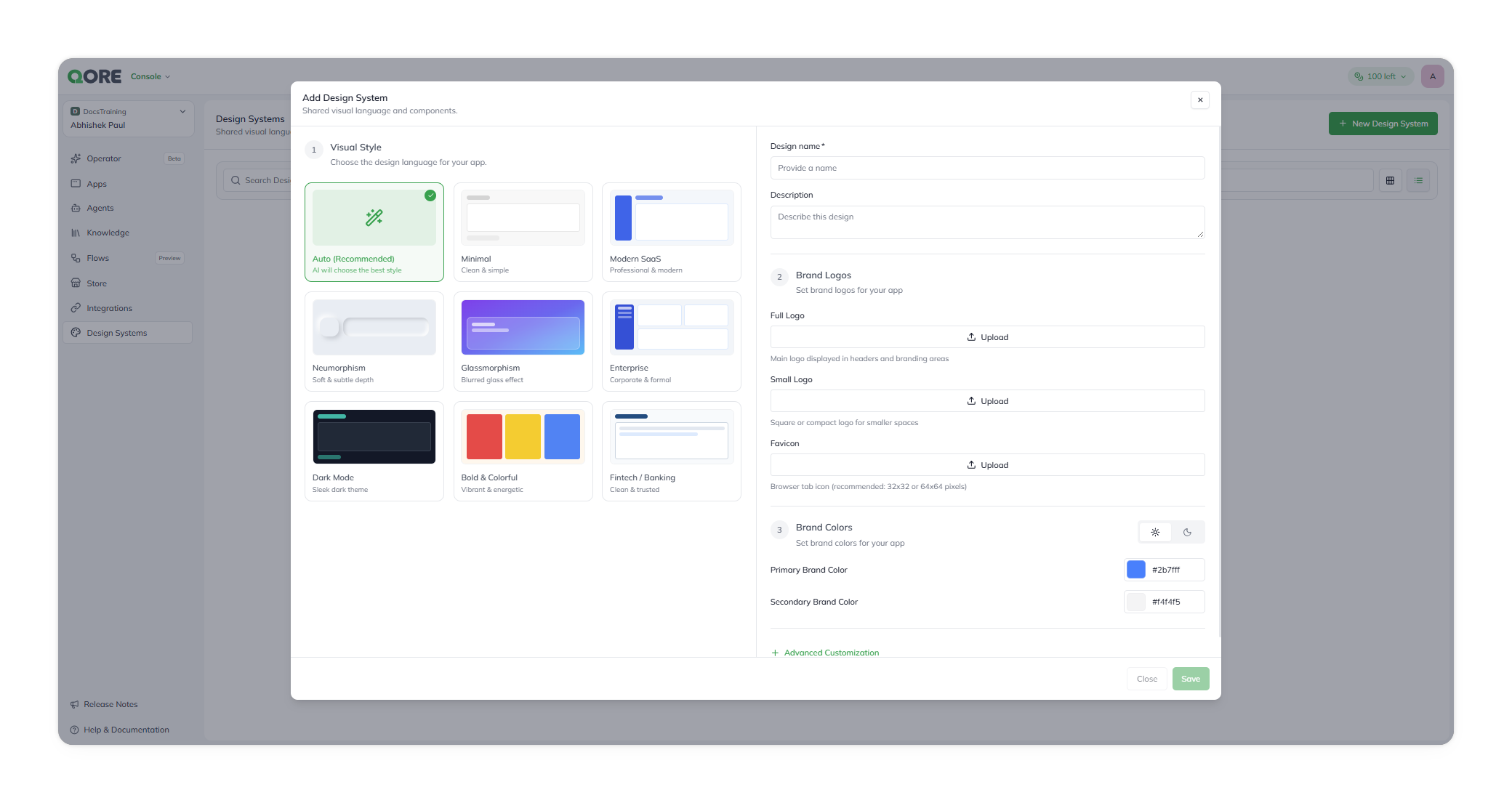
Choose a visual style, add brand logos, and set brand colors. Select **Save**.
The Add Design System dialog, on Visual Style.
{% endstep %}
{% endstepper %}
A confirmation appears when creation succeeds. The new entry shows **Active** and **Updated just now**.
#### Edit a design system
Select a row in the **Design Systems** list. The **Edit Design System** panel opens with saved values prefilled.
The panel uses the same Visual Style, Brand Logos, and Brand Colors steps. Its action button is labeled **Edit**.
{% hint style="warning" %}
The panel notes: *“Changes here apply to this app only, the saved design stays unchanged.”* Confirm how changes propagate before rebranding multiple apps.
{% endhint %}
### Choose a visual style
Visual Style defines your app’s overall design language. It works independently from your brand colors.
Select one style card in the first **Add Design System** step. The selected card displays a green checkmark.
| Style | Best for |
| ---------------------- | ------------------------------------------------------------ |
| **Auto (Recommended)** | Let the system choose a suitable style. This is the default. |
| **Minimal** | A clean, simple interface. |
| **Modern SaaS** | A professional, modern product experience. |
| **Neumorphism** | Soft surfaces and subtle depth. |
| **Glassmorphism** | Blurred, glass-like effects. |
| **Enterprise** | Corporate and formal applications. |
| **Dark Mode** | A sleek, dark-first interface. |
| **Bold & Colorful** | Vibrant, energetic experiences. |
| **Fintech / Banking** | Clean, trust-focused products. |
{% hint style="info" %}
Changing a visual style never overwrites saved brand colors. Combine any style with any color palette.
{% endhint %}
### Add brand logos
Brand Logos provide your app’s recognizable visual assets. Add them in the second **Add Design System** step.
All logo fields are optional. You can save without uploads, then add or replace assets later.
| Asset | Usage |
| -------------- | ------------------------------------------------------------------ |
| **Full Logo** | Your primary logo for headers and branding areas. |
| **Small Logo** | A square or compact logo for constrained spaces. |
| **Favicon** | The icon displayed in browser tabs. Use 32 × 32 or 64 × 64 pixels. |
{% hint style="success" %}
Use a small logo when your full logo loses clarity at compact sizes.
{% endhint %}
### Configure brand colors
Brand Colors define the palette inherited by apps using this design system. Configure them in the third and final setup step.
{% tabs %}
{% tab title="Basic colors" %}
Two fields are always visible. Each has a color swatch and editable hex value.
| Color | Purpose | Default |
| ------------------------- | ----------------------- | ----------------------- |
| **Primary Brand Color** | Main brand color. | `#2b7fff` |
| **Secondary Brand Color** | Supporting brand color. | `#f4f4f5` in light mode |
Both fields include valid defaults. Change only the values your brand requires.
{% endtab %}
{% tab title="Light and dark mode" %}
Use the sun and moon toggle beside **Brand Colors**. It switches the palette you are editing.
For example, Secondary Brand Color defaults to `#f4f4f5` in light mode. It defaults to `#27272a` in dark mode.
Set values for both modes when your app supports theme switching.
{% endtab %}
{% endtabs %}
{% hint style="info" %}
Visual Style and Brand Colors are independent. Selecting another style does not overwrite saved colors.
{% endhint %}
#### Advanced customization
Configure advanced color tokens
Expand **Advanced Customization** to set these optional tokens. Each field includes a swatch and hex input.
| Token | Purpose |
| ------------------------ | -------------------------------------- |
| **Primary Foreground** | Text and icons on the primary color. |
| **Secondary Foreground** | Text and icons on the secondary color. |
| **Background** | Base app background. |
| **Foreground** | Default text and icon color. |
| **Border** | Dividing lines and borders. |
| **Input** | Form input borders or backgrounds. |
| **Muted** | Low-emphasis background surface. |
| **Muted Foreground** | Text and icons on muted surfaces. |
| **Accent** | Secondary highlight color. |
| **Accent Foreground** | Text and icons on accent surfaces. |
| **Sidebar** | Sidebar navigation background. |
| **Sidebar Foreground** | Text and icons in the sidebar. |
---
# Agent Instructions
This documentation is published with GitBook. GitBook is the documentation platform designed so that both humans and AI agents can read, navigate, and reason over technical content effectively. Learn more at gitbook.com.
## Querying This Documentation
If you need additional information that is not directly available in this page, you can query the documentation dynamically by asking a question.
Perform an HTTP GET request on the current page URL with the `ask` query parameter, and the optional `goal` query parameter:
```
GET https://docs.uptiq.ai/console/design-systems.md?ask=&goal=
```
`ask` is the immediate question: it should be specific, self-contained, and written in natural language.
`goal` is optional and describes the broader end goal you are ultimately trying to accomplish on behalf of the user. GitBook uses it to tailor the answer towards what is most useful for that goal.
The response will contain a direct answer to the question and relevant excerpts and sources from the documentation.
Use this mechanism when the answer is not explicitly present in the current page, you need clarification or additional context, or you want to retrieve related documentation sections.